Wordle Clone in Flutter (FLURDLE) - Part 1
Hey Everyone!
I really needed a break from the sketching app and I found out about WORDLE recently. This game has literally taken people by storm and I myself get too involved into it at times. This made me think why not create a series on creating our own Wordle in Flutter? We're going to call it Flurdle since creativity is dead. In this part we will setup the project and get the basic stuff out of our way. We will also try to wind up one aspect of the game in this part and probably make it a 3-4 part series.
An overview of the series would be something like this:
- First part (this) : App theming and keyboard widget (more on this later)
- Second part : Grid and game logic
- Third part: Animation and timers (I love this section already)
- Final part: Finishing touches and one surprise element to make our app distinct
Let's get started!
Project Requirement doc
Before beginning the project, let's try to understand the task at hand. Like the famous saying:
Well begun is half done
If you have never played Wordle before, I would recommend checking it out here. Some observations about the game:
- There is a 5 letter secret word that the player has to guess in 6 chances. There is a grid with 5 columns and 6 rows and each row represents a guess. Topmost row remains active - that is whatever you type/guess goes to the topmost empty row - whenever a guess needs to be made.
- There is a keyboard that allows you to enter the characters of your word. Keyboard also has the ENTER key on the right which seems unconventional but pretty reasonable given there can be erronous guesses if it is kept on the left. I respect the design choice no matter how annoying it is sometimes :emoji
- After you make a guess, letters in the word (or rather the tiles of each letter) turn grey or green or yellow/orange. Grey means that letter is not present in the secret word. Green means letter is present in the sercret word and at the correct place. Yellow/orange means letter is present in the secret word but not in the place you have guessed. (Please check the rules of the game by clicking the :question_mark emoji on the official site)
- If you are able to make a guess within 6 tries, you win. There are prompts for each level on which you make the correct guess. Example: If you guess at the 3rd try the prompt would say "Impressive", if you guess on the 4th prompt would say "Splendid" and so on.
Translating this to the requirements of our app:
- We need 2 widgets to play the game. One is the guess grid, second is the keyboard.
- After a guess is made, the tiles should reveal whether a letter is present in the final word or not. So there is an animation associated with each cell of the grid.
- There should be a pre-defined list of words that can be the possible secret word. There should also be a list to check if the guess is valid, since the word AEIOU does not count as a word.
First steps
As a first step, we need to create a flutter app. Please do so using the command:
flutter create --org com.aadumkhor flurdle
Feel free to change the org tag to something similar if not the same. Also, please install the following packages before hand since these will be used in the project.
flutter pub add flutter_bloc
flutter pub add google_fonts
Let's start with the folder structure of the app directly. I have kept the following structure in lib folder. The files shown are currently empty and just a starting point. Feel free to create the folders and not the files for now 🤩
➜ tree
.
├── main.dart
├── screens
│   ├── home.dart
│   └── index.dart
├── utils
│   ├── colors.dart
│   ├── config.dart
│   ├── index.dart
│   └── theme.dart
└── widgets
    ├── grid.dart
    ├── index.dart
    └── keyboard.dart
Widgets folder is self explanatory. Utils folder includes colors.dart file to contain all the colors used in our app. theme.dart and config.dart are files that are used for the theming of the app. Our app will only have one screen for now which is the home.dart. Let's start with the theming and app colors.
App Theme
Theming is pretty much universal right now. Every modern app has a light and dark theme that allows user to enhance their experience with the app. Since it is such a standard practice I think it is important to set ground rules about how this is done in Flutter. Eagle eyed flutter devs must have noticed that the main.dart file that is created right after the create command contains a theme section. Flutter has excellent support for theming built in by default. Therefore we must capitalize on this power right away!
The usual way of theming a Flutter app is by using the ThemeData class. We can either make our own class that returns a static ThemeData object that we can call in our main.dart. Or the hard way of doing this is to implement the ThemeData class by our own class. This however would require you to implement 88 overrides. So if you're up for that level of detail please do so. Else use the first approach.
ThemeData has a lot of options that we can configure. Some of these include scaffoldBackgroundColor, backgroundColor, textTheme, buttonColor etc. For more details on ThemeData please visit this. For our purpose, we would use the following properties:
- scaffoldBackgroundColor
- textTheme
To keep things simple, I have created a single class for the Theme of this app. This class contains both light and dark theme.
import 'package:flutter/material.dart';
import 'index.dart';
import 'package:google_fonts/google_fonts.dart';

class FlurdleTheme with ChangeNotifier {
  // text config
  static FontStyle? poppins = GoogleFonts.poppins().fontStyle;
  static double headline1Size = 32.0;
  static double headline2Size = 24.0;
  static double headline3Size = 20.0;

  static FontWeight headline1Weight = FontWeight.w700;
  static FontWeight headline2Weight = FontWeight.w400;
  static FontWeight headline3Weight = FontWeight.w300;

  static TextTheme lightTextTheme = ThemeData.light().textTheme;
  static TextTheme darkTextTheme = ThemeData.dark().textTheme;

  static get lightTheme => ThemeData(
      scaffoldBackgroundColor: FlurdleColors.lightBackgroundColor,
      textTheme: TextTheme(
          headline1: lightTextTheme.headline1?.copyWith(
              fontStyle: poppins,
              fontWeight: headline1Weight,
              fontSize: headline1Size),
          headline2: lightTextTheme.headline2?.copyWith(
              fontStyle: poppins,
              fontWeight: headline2Weight,
              fontSize: headline2Size),
          headline3: lightTextTheme.headline3?.copyWith(
              fontStyle: poppins,
              fontWeight: headline3Weight,
              fontSize: headline3Size)));

  static get darkTheme => ThemeData(
      scaffoldBackgroundColor: FlurdleColors.darkBackgroundColor,
      textTheme: TextTheme(
          headline1: darkTextTheme.headline1?.copyWith(
              fontStyle: poppins,
              fontWeight: headline1Weight,
              fontSize: headline1Size),
          headline2: darkTextTheme.headline2?.copyWith(
              fontStyle: poppins,
              fontWeight: headline2Weight,
              fontSize: headline2Size),
          headline3: darkTextTheme.headline3?.copyWith(
              fontStyle: poppins,
              fontWeight: headline3Weight,
              fontSize: headline3Size)));
}
Let me explain the comments in the file in order:
- I have used the library Google fonts to get the font
Poppinsfrom it. The rest of the config is basically font size that I want to use for different headlines in ThemeData. - We are declaring
fontWeightshere to be used in our headlines - Here, we are calling the default text themes from the built in light and dark ThemeData objects. These text themes aleady have some config like
fontColor,weightetc. We can directly use them in our app since we are not willing to modify each override. This saves us a lot of boilerplate code. - Here we define a getter to our lightTheme. It returns a ThemeData object as expected and has a few properties defined. They are self explanatory which is why there is not point going in depth. The headlines that are part of the
textThemeare a standard way of handling text throughout a Flutter app. Headline 1 is the largestfontSizeandweightwhereas 6 has the lowest. Anything text customisation within the app can be narrowed down to these headlines. We are using thecopyWithmethod to override some properties of the headlines that we have already imported from our default text themes. - Similar thing done for our dark theme.
Also, to cover up for the errors in the colors, please copy paste this into colors.dart.
import 'package:flutter/material.dart';

class FlurdleColors {
  // light theme colors
  static const lightTextBox = Color(0xFFE9EEF7);
  static const lightBackgroundColor = Color(0xFFFFFFFF);
  // dark theme colors
  static const Color darkBackgroundColor = Color(0xFF2C3333);
  static const Color darkTextBox = Color(0xFF395B64);

  // common colors
  static const Color greenColor = Color(0xFF2EB086);
  static const Color orangeColor = Color(0xFFFF7F3F);
  static const Color lightTextColor = Colors.white;
  static const Color darkTextColor = Colors.black;
}
Now let's create our first bloc/cubit to handle the theme. I would recommend that you install the official bloc extension on VSCode to make this process simple. Create a new folder called bloc in your lib folder. Right click, select Cubit: New Cubit option from the list (this will be available after the extension is enabled). Name your cubit as Theme. It will create a folder called cubit in the bloc folder along with 2 files: theme_cubit.dart and theme_state.dart
Modify the contents to the following.
theme_cubit.dart
import 'package:bloc/bloc.dart';
import 'package:flurdle/utils/index.dart';
import 'package:flutter/material.dart';

part 'theme_state.dart';

class ThemeCubit extends Cubit<ThemeState> {
  /// initially we show user the light theme
  ThemeCubit() : super(ThemeState(isDarkThemeEnabled: false));

  void toggleTheme(bool value) => emit(state.copyWith(changeState: value));
}
theme_state.dart
part of 'theme_cubit.dart';

class ThemeState {
  final bool isDarkThemeEnabled;
  late ThemeData theme;

  ThemeState({required this.isDarkThemeEnabled}) {
    theme =
        isDarkThemeEnabled ? FlurdleTheme.darkTheme : FlurdleTheme.lightTheme;
  }

  ThemeState copyWith({bool? changeState}) {
    return ThemeState(isDarkThemeEnabled: changeState ?? isDarkThemeEnabled);
  }
}
Explantion:
- Starting with
theme_state.dart. We create a class called ThemeState to hold the state of our theme or simply our theme and the boolean that handles the switching between themes. In the constructor, we use the boolean to determine which theme we need to use for the app. Since theme is alatevariable, it is initialized when it's used. - We also have a
copyWithmethod which we are remotely familiar with. It modifies theThemeStateif there is a change to the boolean value.copyWithas the name suggests copies whatever the class has with changes to only some attributes. So we maintain the same class with updated values. - In
theme_cubit.dart, we create the Cubit that we intend to use to manage the state. For more information on Cubit, please refer to the official documentation. We also have a method to switch the state of the app. Whatever value we get we update theisDarkThemeEnabledvariable and hence change the state.
I understand that this can be difficualt to grasp without having any idea about bloc. Therefore I would suggest having some background on bloc, provider and state management in general to understand this. Instead of using setState within our app we are using a class that handles the state and a sort of interface (cubit) that allows us to make changes to the state class. I would urge you to go through the official documentation for bloc. bloc is also a state mangement technique that is used widely in flutter (it is specifically built for flutter!) so please, give it due attention upfront.
In the main.dart file, add the following code:
import 'package:flurdle/bloc/index.dart';
import 'package:flutter/material.dart';
import 'package:flurdle/screens/index.dart';
import 'package:flutter_bloc/flutter_bloc.dart';

void main() {
  runApp(const MyApp());
}

class MyApp extends StatelessWidget {
  const MyApp({Key? key}) : super(key: key);

  @override
  Widget build(BuildContext context) {
    return MultiBlocProvider(
      providers: [BlocProvider(create: (context) => ThemeCubit())],
      child: BlocBuilder<ThemeCubit, ThemeState>(
        builder: (context, state) {
          return MaterialApp(
            title: 'Flurdle',
            theme: state.theme,
            home: const HomeScreen(),
          );
        },
      ),
    );
  }
}
We are using a MultiBlocProvider (we could use a single BlocProvider widget as well but there are other blocs to be added so we might as well add theme here) to pass down our Cubit to our child widget. Our child widget is basically a builder that allows us to access the state within the builder method. The state in this case is our ThemeState. Whatever is the value of the theme variable (remember the constrctor?) can be accessed here and accordingly the theme will update app-wide.
Take a breather here! You have consumed a lot of information already. Pause here and try to assimilate whatever is shown above this point. Once everything is clear the next step becomes pretty straightforward. If you feel confident, try to implement the home screen on your own as a challenge! Idea is simple. Have a Scaffold widget with an AppBar that has some sort of Switch or Button that let's you change the theme for the app.
Let's create the home.dart file now in our screens folder:
import 'package:flurdle/bloc/index.dart';
import 'package:flutter/material.dart';
import 'package:flurdle/utils/index.dart';
import 'package:flutter_bloc/flutter_bloc.dart';

class HomeScreen extends StatefulWidget {
  const HomeScreen({Key? key}) : super(key: key);

  @override
  _HomeScreenState createState() => _HomeScreenState();
}

class _HomeScreenState extends State<HomeScreen> {
  @override
  Widget build(BuildContext context) {
    final _theme = Theme.of(context);
    return Scaffold(
      appBar: AppBar(
        elevation: 0.0,
        backgroundColor: Colors.transparent,
        actions: [
          BlocBuilder<ThemeCubit, ThemeState>(
            builder: (context, state) {
              return IconButton(
                icon: Icon(
                  _getIconFromTheme(state.isDarkThemeEnabled),
                  color: _getIconColorFromTheme(state.isDarkThemeEnabled),
                ),
                onPressed: () => context
                    .read<ThemeCubit>()
                    .toggleTheme(!state.isDarkThemeEnabled),
              );
            },
          )
        ],
      ),
      body: SingleChildScrollView(
        child: Column(
          mainAxisAlignment: MainAxisAlignment.start,
          crossAxisAlignment: CrossAxisAlignment.center,
          mainAxisSize: MainAxisSize.max,
          children: [
            Center(child: Text("FLURDLE", style: _theme.textTheme.headline1)),

            /// guess grid
            /// keyboard
          ],
        ),
      ),
    );
  }

  IconData _getIconFromTheme(bool state) {
    return state ? Icons.light_mode : Icons.dark_mode;
  }

  Color _getIconColorFromTheme(bool state) {
    return state
        ? FlurdleColors.lightBackgroundColor
        : FlurdleColors.darkBackgroundColor;
  }
}
The code is pretty straightforward. We have added an AppBar that holds an IconButton for our theme. IconButton is wrapped with another BlocBuilder that has access to the ThemeCubit and ThemeState. The helper methods use the boolean value from our state to determine the color and the icon used. onPressed seems pretty weird so allow me to explain that. We are fetching the cubit that was passed down by our provider (MultiProvider from main.dart) to utilise the toggleTheme method that we had implemented in it. The boolean value passed to the method is the flip of the current value of isDarkThemeEnabled. This way we are able to switch between the themes.
The Icon and it's Color are fetched from 2 helper methods defined below our build method. The SingleChildScrollView makes up for the body of our app. Its child is a Column widget that contains a Text widget that is centered. To style the text we have used the theme from our main.dart. We have received it here in this line:
final _theme = Theme.of(context);
Theme is being passed down the widget tree and we have access to it here.
Now let's test the application. Run it in a simulator or emulator for Windows. The result should be similar to what I have here:
Now we can focus on the actual widgets used in the app. We'll start with the keyboard widget since that is relatively easier.
Keyboard Widget
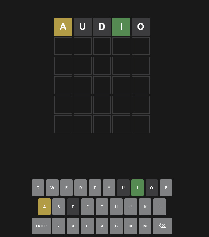
Wordle has a special keyboard as part of the game. I don't mean that it has the ENTER key on the left and backspace on the right. It is special since it allows the user to enter a character in the grid and when the user submits the answer it also highlights the letters in the same way they are highlighted on the grid. Let's say your guess was AUDIO. If A is present at the right spot then the keyboard would show a green 'A' on the keyboard. If 'I' is in the final word but not in the right spot, it will show a yellow I on the keyboard. The remaining letters are blacked out to show they are not a part of the final word. Example of this can be seen in the following image:
Naturally, our keyboard must support a similar functionality. Breaking down our task, it is correct to say that each key is a Widget that has 2 properties: The letter which it inputs when pressed and the current color depending on its position in the final word. Let's start with that. In the widgets folder, let's create a file called keyboard_key.dart. The Widget would contain 2 properties as discussed, a Color property and a key property which I would like to declare as an enum. We can also use a string but an enum would ensure deterministic states.
Initially, the file would include just the constructor of this Widget and the enum like so:
// ignore_for_file: avoid_print

import 'package:flurdle/bloc/index.dart';
import 'package:flutter/material.dart';
import 'package:flutter_bloc/flutter_bloc.dart';

enum KeyboardInput {
  q,
  w,
  e,
  r,
  t,
  y,
  u,
  i,
  o,
  p,
  a,
  s,
  d,
  f,
  g,
  h,
  j,
  k,
  l,
  z,
  x,
  c,
  v,
  b,
  n,
  m,
  enter,
  backspace
}

class KeyboardKey extends StatelessWidget {
  final Color currentColor;
  final KeyboardInput keyboardInput;

  const KeyboardKey(
      {Key? key,
      this.currentColor = Colors.black45,
      required this.keyboardInput})
      : super(key: key);

  @override
  Widget build(BuildContext context) {

  }
}
We have created an enum as discussed and included all possible inputs. We have also initialised a constructor for our Widget that would default the color to a shade of black if it's absent and has a required property of the KeyboardInput enum. Since we are focusing on the UI part of the keyboard, we will ignore the logic for enter and backspace in this part. We will treat them as regular keys with some tweak to their logic. Enter the following code to the same file:
class KeyboardKey extends StatelessWidget {
  final Color currentColor;
  final KeyboardInput keyboardInput;

  const KeyboardKey(
      {Key? key,
      this.currentColor = Colors.black45,
      required this.keyboardInput})
      : super(key: key);

  @override
  Widget build(BuildContext context) {
    final _theme = Theme.of(context);
    return Padding(
      padding: const EdgeInsets.all(4.0),
      child: InkWell(
        onTap: () {},
        child: AspectRatio(
          aspectRatio: 2 / 3,
          child: Container(
            decoration: BoxDecoration(
                color: currentColor, borderRadius: BorderRadius.circular(4.0)),
            child: Center(
              child: Text(
                keyboardInput.name.toUpperCase(),
                style: _theme.textTheme.headline2,
              ),
            ),
          ),
        ),
      ),
    );
  }
}
The code is self explantory. We are using the InkWell widget to add a splash effect on press while also having an onTap callback (currently empty). The value for aspectRatio is hard coded after some testing so please accept it the way it is. The color of each container is given by the currentColor and the text for each key is given by the enum value.
Data singleton and new Cubit
For the onTap callback, we must add some logic to enter the value of the keyboard key into the grid as part of our guess. However since we are not implementing the grid in this part, we will add something else to show that the keyboard does work. My plan is to register keystrokes in the terminal so that we can check our functionality. While we are at it, we can also start with our data class that would keep track of all keystrokes and generate a word based on our input. This class must hold a string that corresponds to our current guess.
We can make a Singleton to do so. Singleton is a design pattern that restricts the instantiation of a class to one single instance throughout the app. This Singleton would include the word we are forming by pressing these inputs. Our Singleton cannot exist in isolation from our bloc. Our bloc would be the layer via which we would be making updates to this data class.
Let's start by creating a new folder called data in our lib folder.
Create a file called data_singleton.dart. Add the following code to it:
class DataSingleton {
  static final DataSingleton _dataSingleton = DataSingleton._internal();

  factory DataSingleton() {
    return _dataSingleton;
  }

  // named generative constructor
  DataSingleton._internal() {
    // TODO
  }
}
We are creating a factory constructor for this class. Let me explain how this is different from a regular named constructor. A factory constructor is a constructor that can be used when you don’t necessarily want a constructor to create a new instance of your class. This might be useful if you hold instances of your class in memory and don’t want to create a new one each time (or if the operation of creating an instance is costly). Our data singleton will be our source of truth for the app. Any input that we enter via the keyboard, generation of secret word and storing it in memory, checking the characters for their presence in the secret word etc. can all be done with this singleton. Therefore, it must be instantiated in memory and only once throughout the app. We don't really need the class to be initialized, we just need an object that can perform what the class is meant to do. To learn more about factory constructors please refer to this link. It has explained this concept beautifully and this was the answer that convinced me to use factory constructors for singletons :) . I will implement the generative constructor later on.
Now to test our functionality, let's add a string to out data class to hold our current input. We also need to add methods to this singleton to check if it is possible to add letters and delete letters from the existing value of our string. We'll call this string "guess" to make the implication clear. Add the following methods to the singleton:
  bool addLetterToGuess(KeyboardInput input) {
    /// handling the case if enter is pressed.
    /// for now we address this case and add extra logic to it
    /// to print the result
    if (input.name == KeyboardInput.enter.name) {
      print("Current guess: $guess");
      return true;
    }

    /// check length of guess to ensure only 5 letters are entered
    if (guess.length < 5) {
      guess = guess + input.name;
      return true;
    }

    return false;
  }

  void removeLetterFromGuess() {
    int wordLength = guess.length;

    if (wordLength > 0) {
      guess = guess.substring(0, wordLength - 1);
      print("Current guess: $guess");
    }
  }
addLetterToGuess is simple enough. We are checking if the guess length is less than 5 and allowing input if that is the case. We are returning a boolean value for us to track in the bloc. This value would help us emit a state and will also be used to update the UI once we implement the grid. As discussed, we have added a special logic for the 'enter' key. For now we are returning true from this method for 'enter' but later on we will add a separate method to submit our guess and check.
removeLetterFromGuess is similar. This functionality is for the 'backspace' key. We have also added a check on the word length.
Our data layer is ready. Now let's setup the interface to interact with it. Let's build another cubit (using the VSCode extension explained in the theme section) and call this one HomeCubit (since this is the part of the home screen essentially). Feel free to rename the folder name to home (since default is 'cubit'). Add the files to your index.dart file if are maintaining one like I am xD
This cubit must be capable of calling the methods we have implemented in the singleton. Let's not worry too much about the HomeState right now. We will keep it simple since we just have to test functionality.
home_state.dart
part of 'home_cubit.dart';

abstract class HomeState extends Equatable {
  const HomeState();

  @override
  List<Object> get props => [];
}

class HomeInitial extends HomeState {}

class WordUpdateState extends HomeState {}
I have added a single state to register an update to our guess. Now let's implement our cubit:
home_cubit.dart
import 'package:bloc/bloc.dart';
import 'package:equatable/equatable.dart';
import 'package:flurdle/data/index.dart';
import 'package:flurdle/widgets/index.dart';

part 'home_state.dart';

class HomeCubit extends Cubit<HomeState> {
  HomeCubit() : super(HomeInitial());
  DataSingleton data = DataSingleton();

  void setLetter(KeyboardKey key) {
    if (data.addLetterToGuess(key.keyboardInput)) {
      emit(WordUpdateState());
    }
  }

  void removeLetter() {
    data.removeLetterFromGuess();
    emit(WordUpdateState());
  }
}
This implementation is easy to grasp. We are calling our data class here to initialize it and we have implemented 2 methods to update the guess depending on the keystroke. Based on the boolean value we get from the data class, we emit our state.
To make sure that our HomeCubit is passed down our widget tree let's add it to the main.dart file as well.
main.dart
import 'package:flurdle/bloc/index.dart';
import 'package:flutter/material.dart';
import 'package:flurdle/screens/index.dart';
import 'package:flutter_bloc/flutter_bloc.dart';

void main() {
  runApp(const MyApp());
}

class MyApp extends StatelessWidget {
  const MyApp({Key? key}) : super(key: key);

  @override
  Widget build(BuildContext context) {
    return MultiBlocProvider(
      providers: [
        BlocProvider(create: (context) => ThemeCubit()),
        BlocProvider(create: ((context) => HomeCubit()))
      ],
      child: BlocBuilder<ThemeCubit, ThemeState>(
        builder: (context, state) {
          return MaterialApp(
            title: 'Flurdle',
            theme: state.theme,
            home: const HomeScreen(),
          );
        },
      ),
    );
  }
}
I hope now it's clear why we have used MutliBlocProvider here.
Now we can actually test this out. But to do so, we need to change KeyboardKey Widget slightly.
KeyboardKeys update
Modify the onTap callback to this (modify the file appropriately since this is a single section of the code):
final homeCubit = BlocProvider.of<HomeCubit>(context);
return Padding(
  padding: const EdgeInsets.all(4.0),
  child: InkWell(
    onTap: () {
      if (keyboardInput == KeyboardInput.backspace) {
        print("Backspace...deleting letter");
        homeCubit.removeLetter();
      } else {
        print("Pressed: ${keyboardInput.name.toUpperCase()}");
        homeCubit.setLetter(this);
      }
    },
Elementary but this would get the job done.
Keyboard layout
With all this in place, let's build the layout for our keyboard. In the keyboard.dart file (created during planning phase) add the following:
import 'package:flurdle/widgets/index.dart';
import 'package:flurdle/data/index.dart';
import 'package:flutter/material.dart';

class Keyboard extends StatelessWidget {
  const Keyboard({Key? key}) : super(key: key);

  @override
  Widget build(BuildContext context) {
    return SizedBox(
        width: MediaQuery.of(context).size.width,
        child: Column(children: [
          Row(
            children: firstRow
                .map((e) => Flexible(
                        child: KeyboardKey(
                      keyboardInput: e,
                    )))
                .toList(),
          ),
          Row(
              children: secondRow
                  .map((e) => Flexible(
                          child: KeyboardKey(
                        keyboardInput: e,
                      )))
                  .toList()),
          Row(
            children: thirdRow
                .map((e) => Flexible(
                        child: KeyboardKey(
                      keyboardInput: e,
                    )))
                .toList(),
          )
        ]));
  }
}
We are creating a list of Widgets from a list using the map function. The list is defined in the data class as a constant like so:
keyboard_rows.dart
import 'package:flurdle/widgets/index.dart';

const List<KeyboardInput> firstRow = [
  KeyboardInput.q,
  KeyboardInput.w,
  KeyboardInput.e,
  KeyboardInput.r,
  KeyboardInput.t,
  KeyboardInput.y,
  KeyboardInput.u,
  KeyboardInput.i,
  KeyboardInput.o,
  KeyboardInput.p
];
const List<KeyboardInput> secondRow = [
  KeyboardInput.a,
  KeyboardInput.s,
  KeyboardInput.d,
  KeyboardInput.f,
  KeyboardInput.g,
  KeyboardInput.h,
  KeyboardInput.j,
  KeyboardInput.k,
  KeyboardInput.l,
];
const List<KeyboardInput> thirdRow = [
  KeyboardInput.enter,
  KeyboardInput.z,
  KeyboardInput.x,
  KeyboardInput.c,
  KeyboardInput.v,
  KeyboardInput.b,
  KeyboardInput.n,
  KeyboardInput.m,
  KeyboardInput.backspace,
];
Bringing it all together
Add the Keyboard widget to your index.dart file and then add it to your home.dart like so:
      body: SingleChildScrollView(
        child: Column(
          mainAxisAlignment: MainAxisAlignment.start,
          crossAxisAlignment: CrossAxisAlignment.center,
          mainAxisSize: MainAxisSize.max,
          children: [
            Center(child: Text("FLURDLE", style: _theme.textTheme.headline1)),
            /// guess grid
            /// keyboard
            const Keyboard()
          ],
        ),
      ),
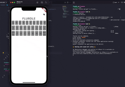
Now the moment of truth. Restart the appication from the terminal. I warn you, the app might not look good just yet but this is a strong foundation. You can see from the gif that keystrokes are being registered from our keyboard. Enter and backspace are functional as well in their own way :P
Couple of observations:
- Our 5 letter word limit works. After 5 inputs our word does not accept any more letters
- Backspace works as intended.
- Enter is submitting the word to terminal for now XD
Conclusion
If you feel you have done a lot of work, you're right. We are almost halfway complete with our bare bones application. Please go through the concepts explained here multiple times and read through the documentation for bloc to strengthen your understanding. I would see you all in the next one to complete our functional (not aesthetic yet :p) Wordle clone. Check out the source code at :
Pat yourself on the back if you read it till this point.